
Agoda Flights
Complete Your Journey with Seat Selection
§
CONTEXT & CHALLENGE In early 2020, Agoda Flights has launched for six months achieving 1K daily booking. We started transferring our focus from little enhancement to large-scale features, aiming to become a more mature product to fulfill all the customers' needs. Compared to the competitors, there is still a long way to chase.
Seat selection is one of the core features. Not to mention that it is a sophisticated project, we also have a high dependency on the supplier to define the scope and confirm the data they could provide. Therefore, we launched the feature with the free selection that it certainly reduces the risk of implementation. From a scalable perspective, we still consider the paid seats to accommodate the scenario afterward.
Timeline
March to April 2020 (3 weeks)
March to April 2020 (3 weeks)
Team
Designers (2), Product Manager (2), Engineers (12+), QA (2)
Designers (2), Product Manager (2), Engineers (12+), QA (2)
My role
Competitive Analysis, User interview, Research, UI/UX Design (App)
Competitive Analysis, User interview, Research, UI/UX Design (App)
· · ·
DESIGN HIGHLIGHT
Clarity of the Information with Sophisticated Details
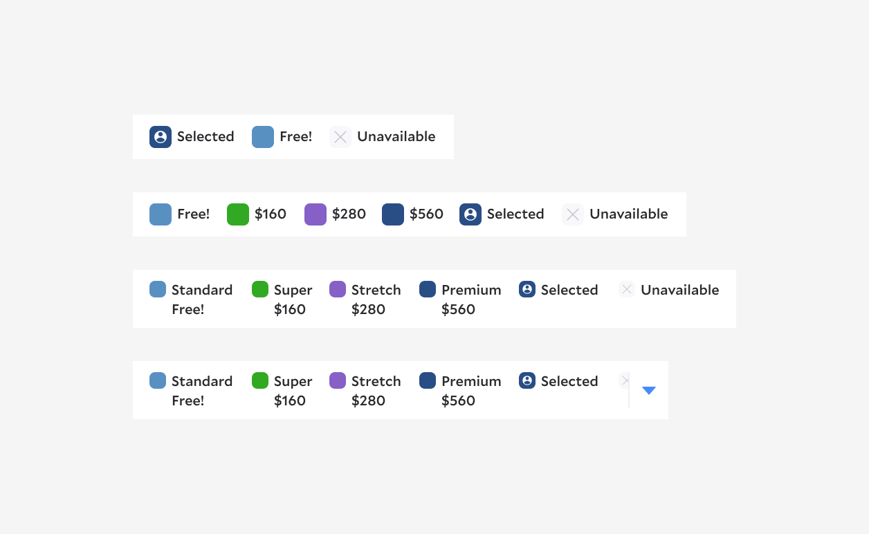
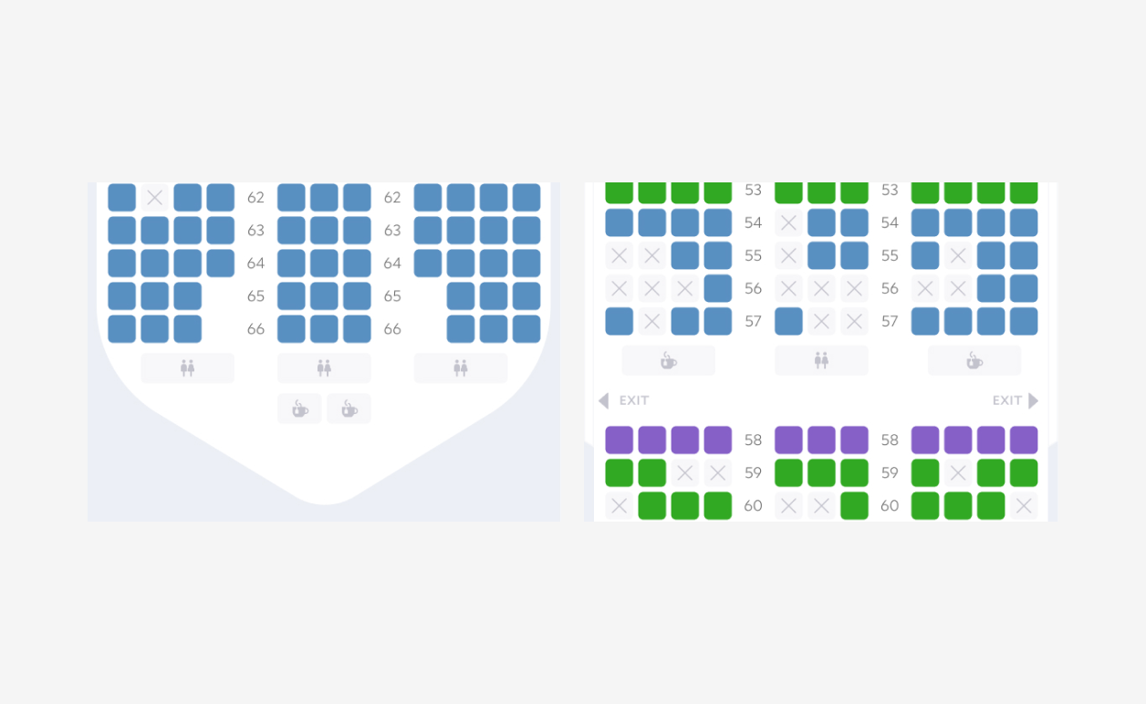
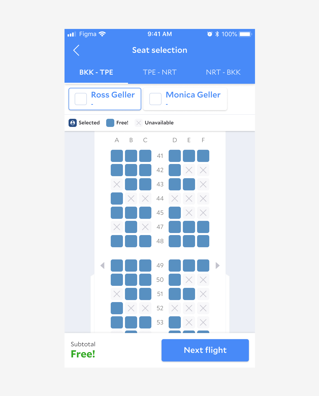
The experience of selecting seats involving a bunch of information, from the flight segment, passenger types, seating restrictions & fare, and facilities on the plane. It is critical to display all the information clearly to help the customer making the decision based on the complexity of their personal preference. Therefore, we aimed to surface the bare minimum of the information to be straightforward and direct to simplify the decision-making process.
DESIGN HIGHLIGHT
Directly Interaction to Help Make Decisions
While the customer considering the seating between price, position, and preference, it guides them better with fluent interaction and real-time feedback. When it comes to group travelers and multiple slices, we designed many details such as updating the subtotal, the attribute of seats, and zooming to help them complete the tasks faster.
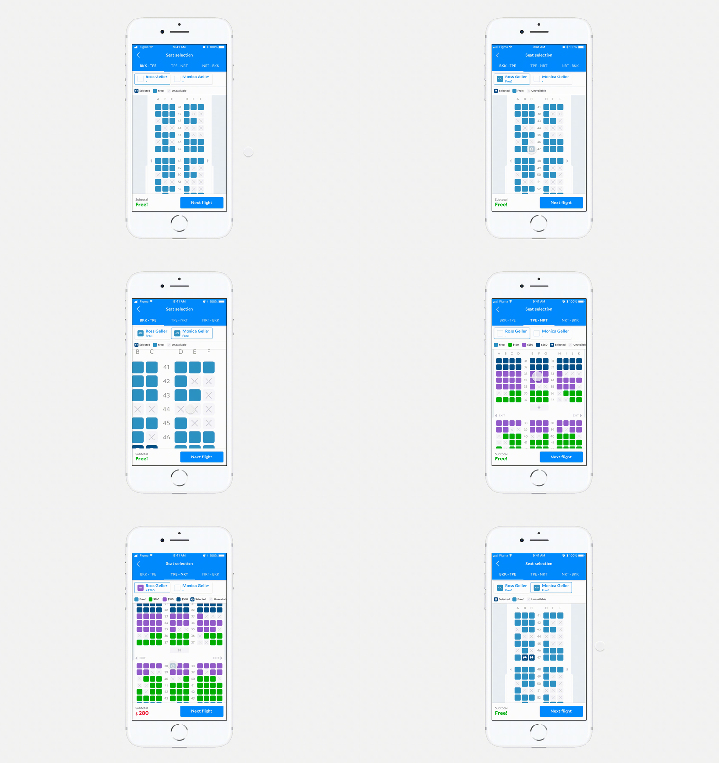
Simple and slick to keep the users focus on decision making.
Reflection
· · ·
Benchmarking helps (a lot) for introducing a new feature - Especially for the later progress, there are many little fine-tune needing a quick decision . When engineers were building it, I already shifted my focus to other projects. It helps to recall the memory from a couple of screenshots and the research summary.
User interview to collect insights - We rarely have the chance to conduct formal user interviews every time. For such a complex new feature like seat selection, it is undoubtedly helpful to collect insights across the users as much as possible. There are also convincing proofs to back up design decisions based on real user behavior.
QA engineers, the hidden figure - The most satisfying experience I have for this project is building a strong relationship with QA engineers. Seat selection is a large-scale project with many industry knowledge, business goal, and development restriction to consider. I was grateful for the QA engineers being a trusting member of the team.
Ask for feedback from the engineers - For a more complex new feature, we need to design more feedback to smooth the experience. We think about micro animations to enhance this part to the users. Sometimes, ideas might fly too far away from the goal. I appreciated that our engineers are collaborated to join the design discussion and share feedback from the technical side. We save lots of time on delivering a too fancy solution then start over again. With team collaboration, we find a better balance between realistic, useful, and lovely solution.
User testing for enhancement - When it was close to the later stage of the project, we started WFH due to COVID-19. Unfortunately, we were not getting the chance to conduct the user testing session, which I believe that it will be super helpful for iteration and future phase.
THE PROCESS / 01
Research, Understand & Define
· · ·
COMPETITIVE ANALYSIS
Feature Comparison to Understand the Industry Standard
At the beginning of the kick-off, we didn't receive well-defined requirements, and the back-end engineers were figuring out the data from the suppliers. Designers started from benchmarking to understand the fundamental functions of seat selection. Based on the feature comparison, I noted down the various scenarios, features, flow, chance for optimization, and potential risks, as a starting point to explore how we could shape the product and define the scope of MVP.
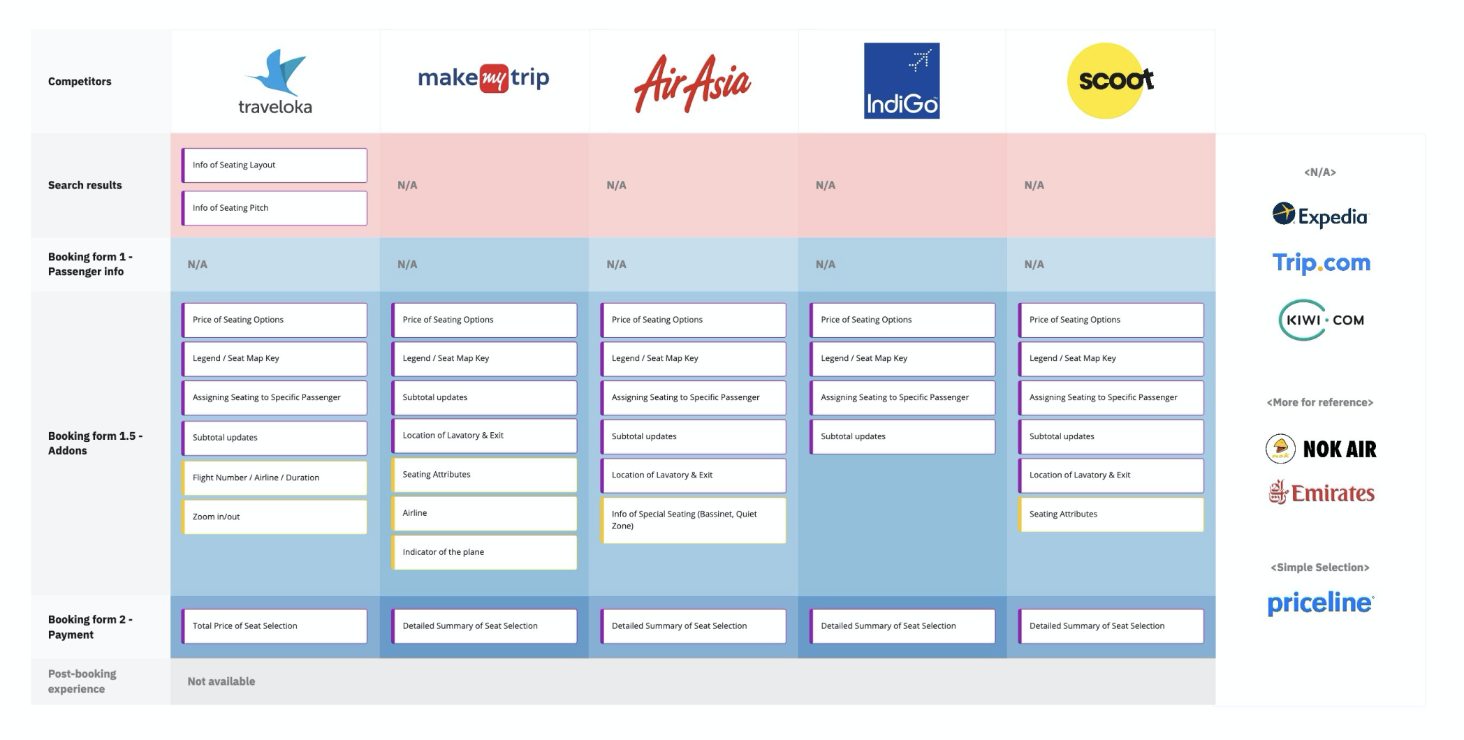
Noted the features across the process. Purple stands for fundamental function, yellow stands for the uncommon trait comparing to other products.
IN-DEPTH INTERVIEW
Collecting Insights from the Users
Since it was an entirely new feature, and we still have enough lead time. We decided to do the user interview to collect more insights from the real users. The research plan, discussion guides, and all five sessions were all conducted by the designers.
RESEARCH GOAL
Define the scope of MVP in the first phase
KEY QUESTIONS
What is the intention to select a seat?
What kind of information is not necessary to help travelers make decisions?
What can they do without when looking at all the content that is on the page?
What kind of considerations goes into selecting the seats?
For those not selecting seats during booking, would they choose it during post-booking or online check-in?
At which point during the booking would the customer prefer to choose the seats?
In what situation would the travelers pay for the seats?
PARTICIPANTS OVERVIEW
Four participants preferred booking with airlines depends on the destination and the Frequent-flyer program they have.
Three participants mentioned that they usually book through the desktop.
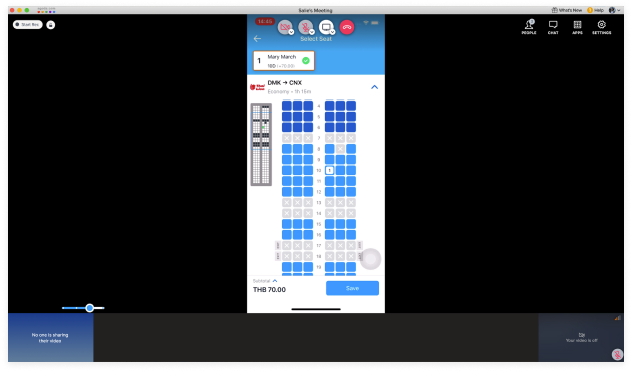
We interviewed by video call due to work-from-home policy when the COVID-19 hit. It is tricky to observe behavior outside of the screen since participants only shared their mobile screen
FIND-OUTS
When the seat map is clear enough in terms of information and UI, the participants didn't pay attention to the seat legend. However, it is still critical to explain different options if they want to check more details.
They all have precise preferences on seat selection: (1) Front (The very front of the available options) (2) Window/Aisle/ No middle (3) Legroom (4) Distance to the toilet/exit (especially for kids and elder)
The intention to choose seats during booking is the same for everyone: (1) If free (2) If travel with family (kids, parents) or friends (sit together) (3) Long-haul flights (3.5 hrs+) (4) Crowded flights
When landing on the selection page, it always takes a long time that seems to have crashed.
NEXT STEP
Make sure the UI of the seat map is clear enough to recognize
When offering various options of seats, do clarify the difference or benefits of the seats
Make sure we display the first available seat visible without scroll when landing on the page
Display clearly which seats belong to which passenger
Consider the special request for some specific types of traveler, such as kids, elderly, business and disabled
Reminder for selecting seats when it's free
Reminder for group traveler
Allow users to choose seats after booked
Make sure we display clear feedback for loading
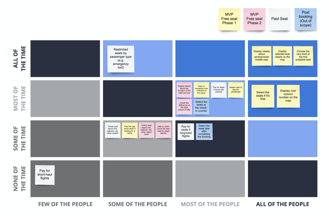
By features audit, we organized the potential features in terms of frequency adoption (amount of people using them). Post-its in the dark blue area were the actions been used by the participants the most. We also categorized all the behaviors and insights into implementation stages as a preliminary analysis.
RESEARCH SYNTHESIZE
Define the Bare Minimum of the Project
Considering the dependency on the supplier and the development effort, we're looking for the MVP version of the solution to reduce the risk during implementation. Hence, after the research phase, we broke down all the features and requirements into phased tasks.
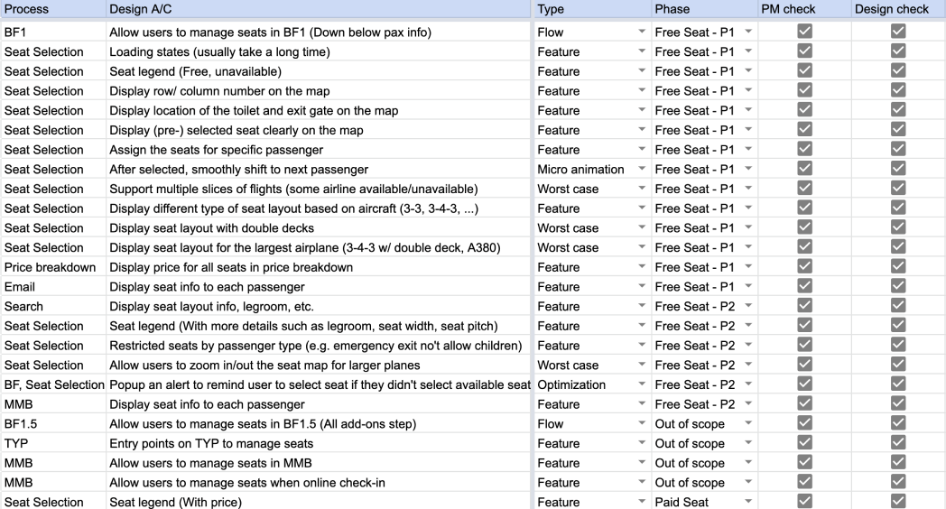
We listed out the potential design criteria and discussed the project scope with the product manager.
THE PROCESS / 02
Design & Iterate
· · ·
PRELIMINARY EXPLORATIONS
Early Concepts to Gather Feedback and Direction
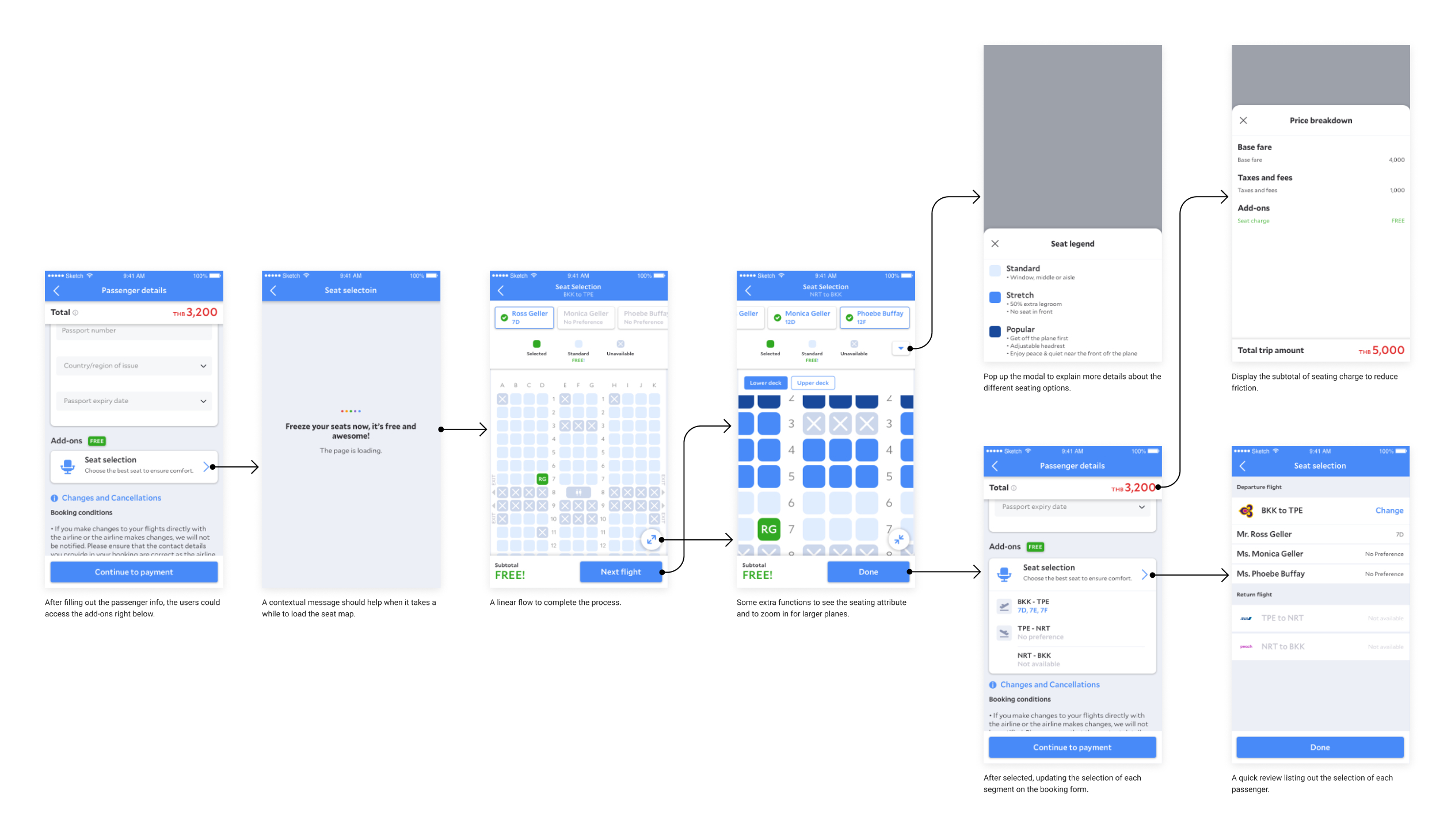
The interface might be the most challenging part of this project. For mobile, it is even harder to display so much information on the little tiny screen. In the beginning, I focused on the info structure and the overall flow.
DESIGN ITERATION
Deep Dive into the Details
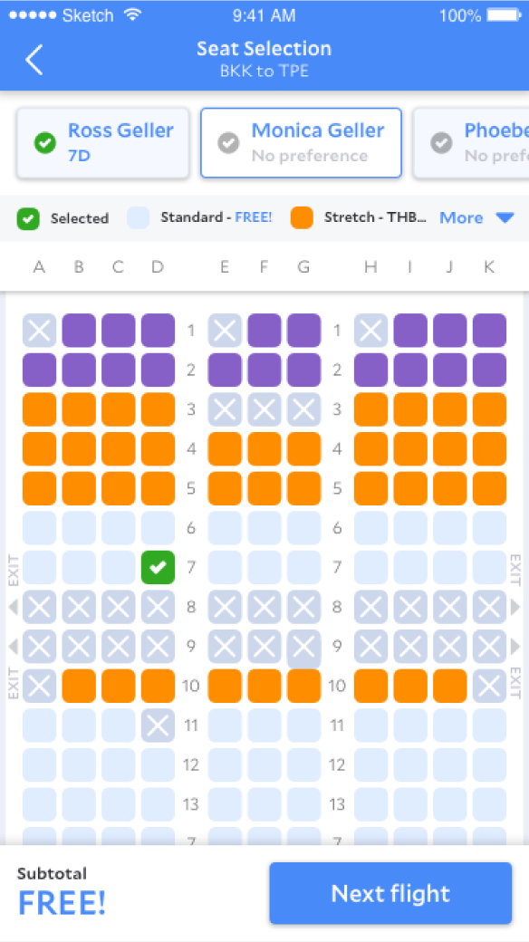
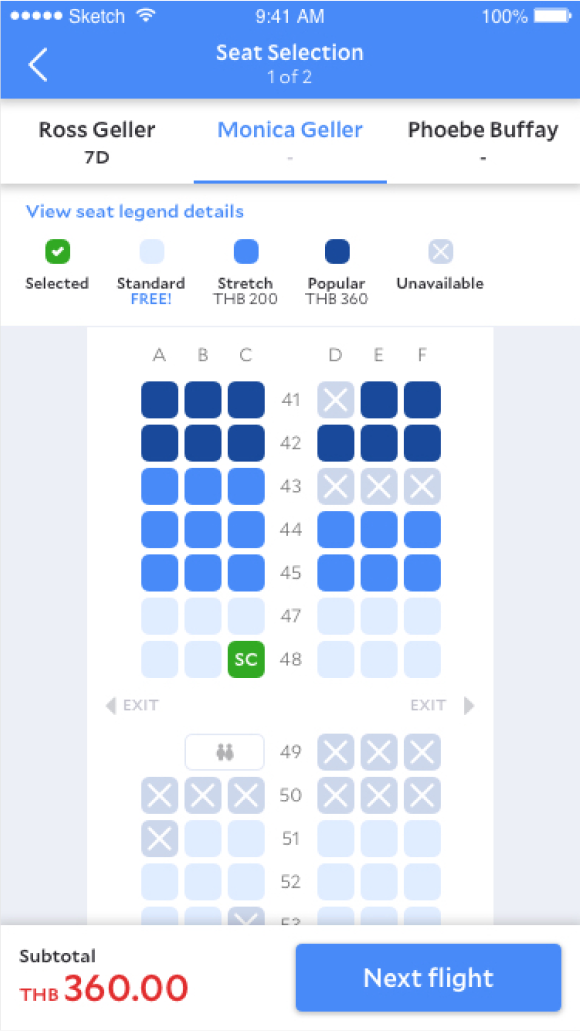
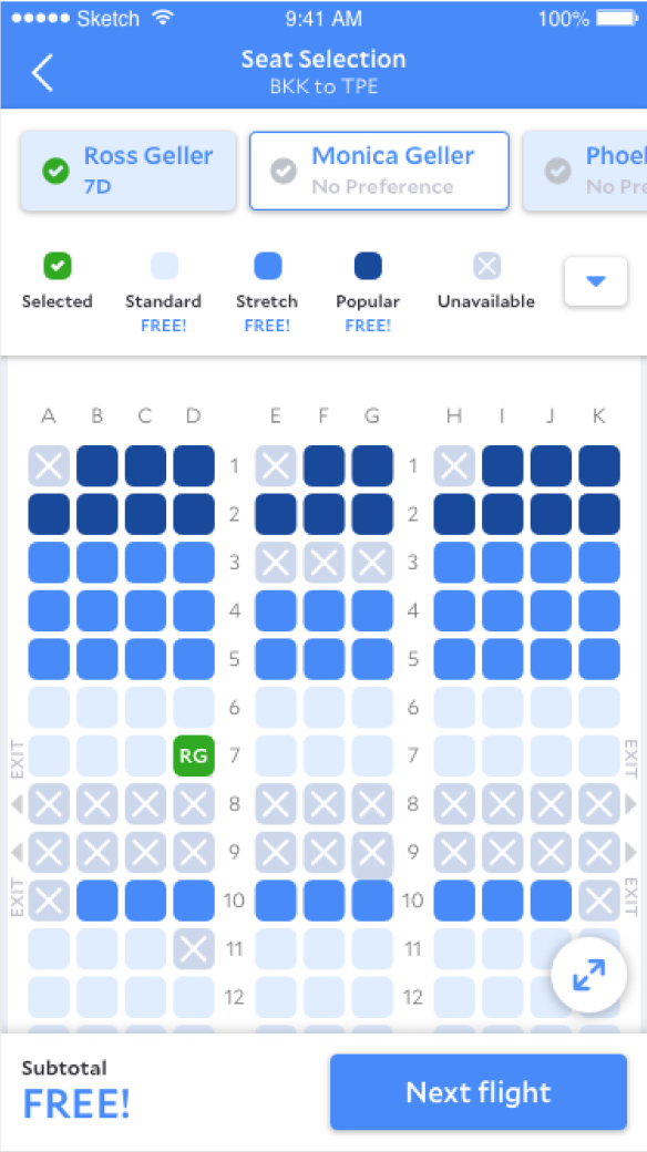
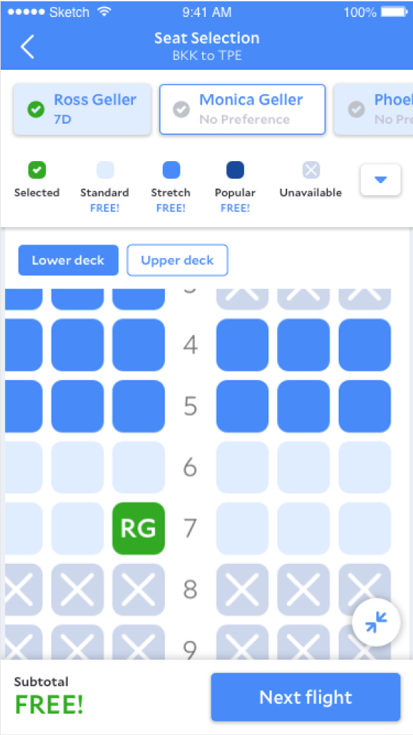
After confirming the flow, I put more effort into the exploration of the selection process. There are flight segments, passenger selection, seat legend, seat map, and the price update. We were looking for an approach to make the display more delightful and explain clear on what's the current state of the process.
FINAL DESIGN
Free Seats for Launch and the Next Phase
Based on the timeline and the development effort, we did compromise to simplify the process as much as possible. The most challenging part must be the worst case for multiple segments and multiple stops flight. The design also should be scalable to the paid options.
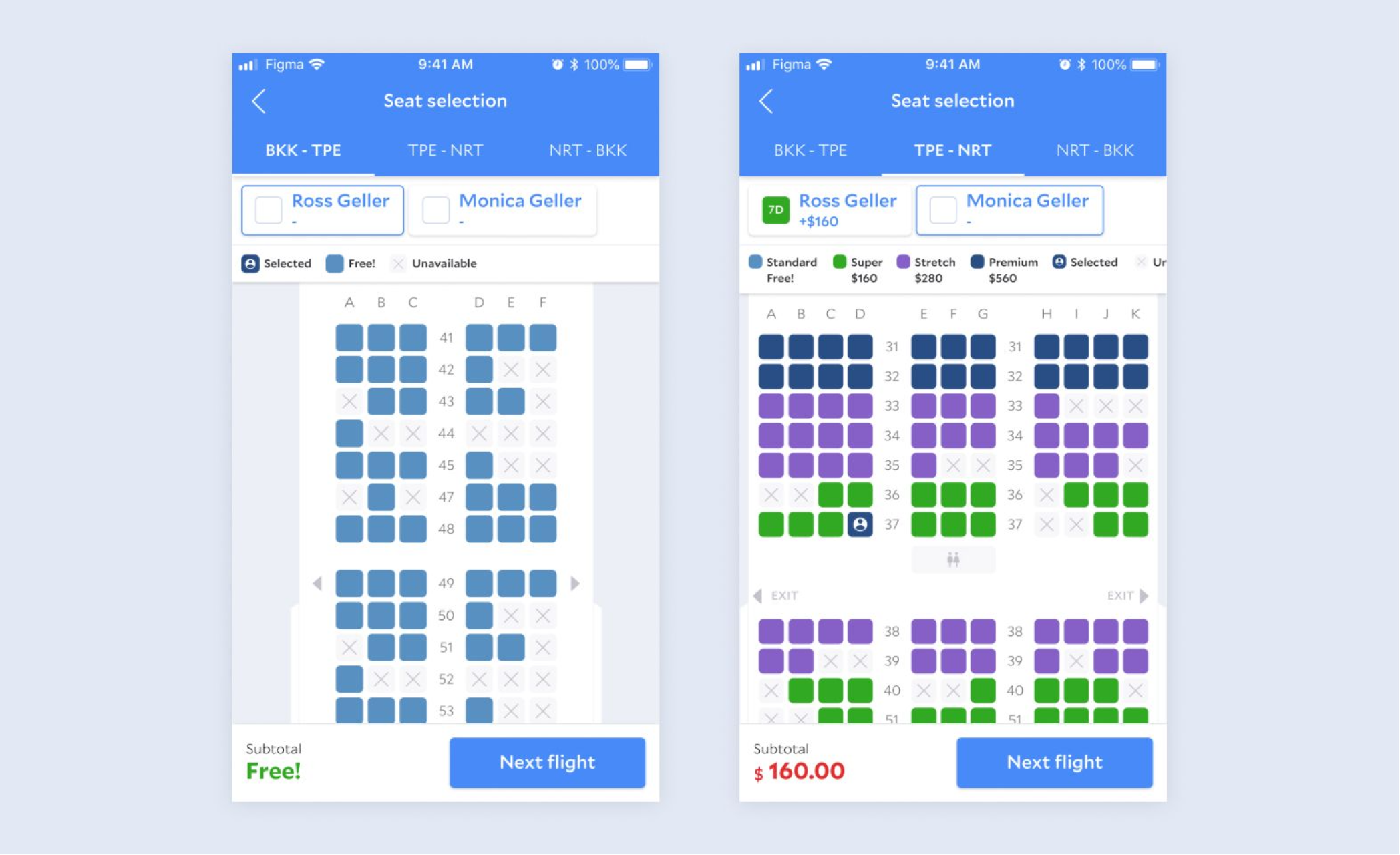
We implemented the free selection when launched. Considering the paid option is coming later, it was critical to design the process with it in mind.
THE PROCESS / 03
Evaluate
· · ·
TECHNICAL REVIEW
Refine the Details to Close the Gap
When we implemented the project, there were more issues to recognize from the supplier. It is hard to understand all the technical constraints and define the solution accordingly. Therefore, we worked closely with the QA engineers at the last mile to prepare all the worse scenarios. I appreciated their effort to be the bridge between the designer, developer, business insight, and provide suggestions at balance.
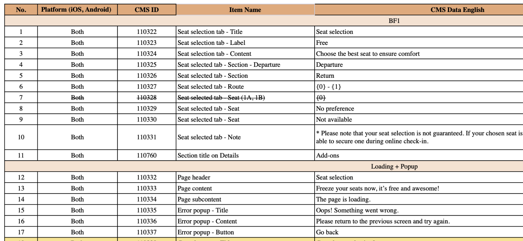
A completed excel to list down all the CMS across the platforms waiting for translation.
OUTCOME
Introduce the Core Flight Feature to Customers
After we launched the feature for A/B testing, over 16K users have interacted with it within one week. And we still look for more suppliers to join to offer more options. Although we reached a few people, we found only 5.02% of the users complete the flow for selecting seats. One assumption is that we place the "done" the CTA to finish the flow to the last segment on purpose. We force users to go through all the flight segments to increase the touchpoint that says some people might ignore it and fail to select the seats. Another assumption is that most of our bookings are domestic and low-cost carriers now. The need to choose seats are not crucial to customers.
*Due to confidential restriction, please reach out for more details.
*Due to confidential restriction, please reach out for more details.