KINJO Jewelry

An E-commerce Site Brings a 12-year Brand a New Picture

§

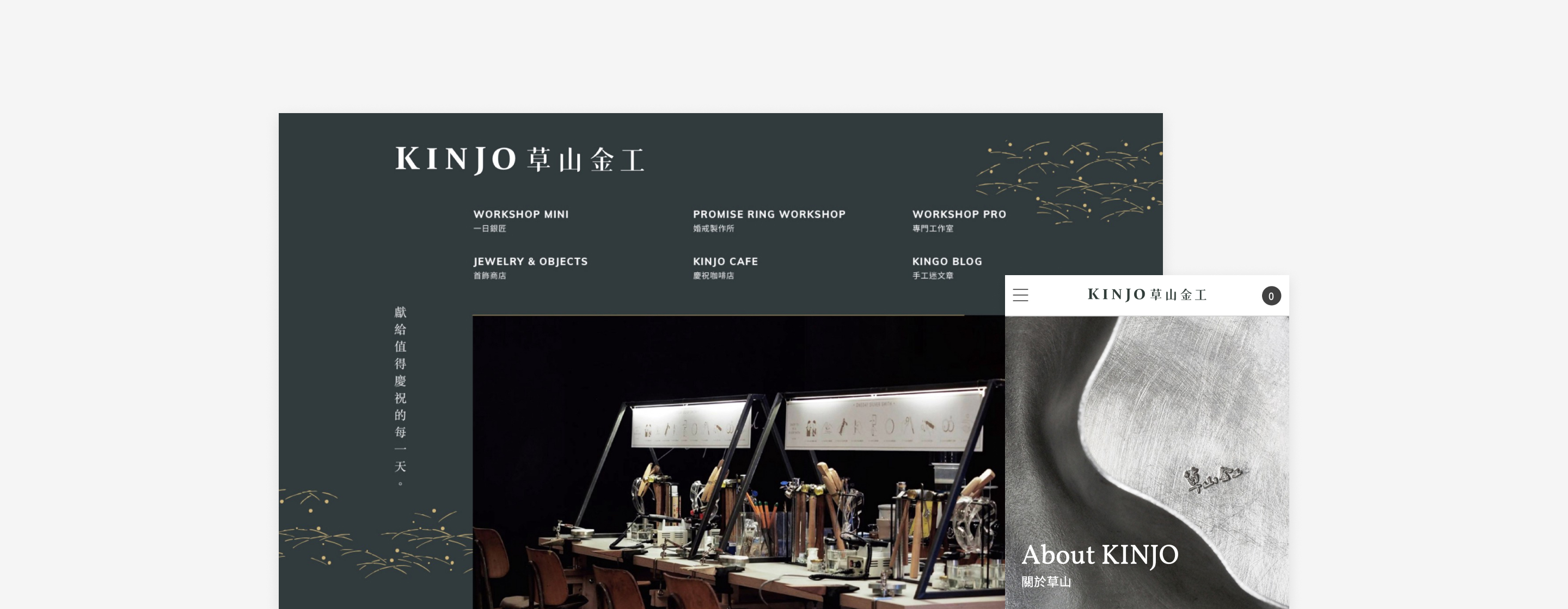
CONTEXT  With a 12-year history, KINJO is the top one metalworking & workshop brand in Taiwan. Now they have eight stores, attracting more than 1,800 tourists to experience handmade rings every month. The goal of this project is to build an e-commerce site. To collect customer data, manage orders, and reserve workshop online. Also, reshape their digital branding to improve the efficiency of their marketing strategy and sales.

CHALLENGE  It is not only an e-commerce site, but all the businesses of KINJO need to integrate into one place. We spent lots of time figuring out the need of clients, customers, and the brand. The most challenging part is to find the balance and not overwhelm people. Speaking of the project scope, it is also a challenge for me and all the team members to collaborate and communicate along the working process.

Timeline
Jan 2018 - Oct 2018
Team
Designers (2), Product Manager (1), Engineers (3)
My role
Competitive Analysis, Flowchart, Wireframe, Web Design, Design System
· · ·
DESIGN HIGHLIGHT
Treat Every Movement Gently and Carefully
To create the elegance and classic of the brand image, we carefully select the serif font for English characters and use high-end photography. Other than that, we spent more effort on tweaking the animation with engineers. These subtle details might be hard to notice, and customers naturally enjoy the experience.
Reserve the course
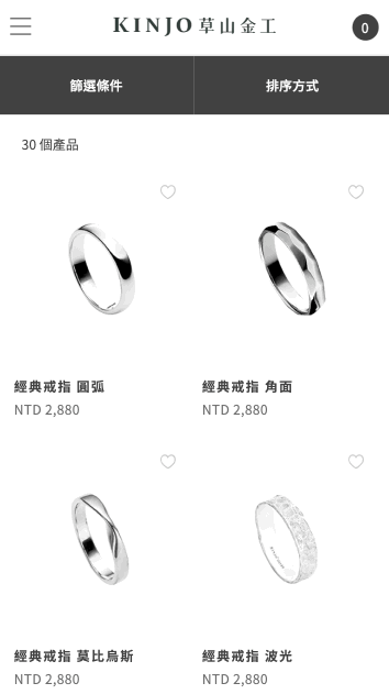
Filter and favorite products
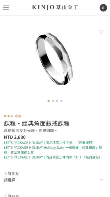
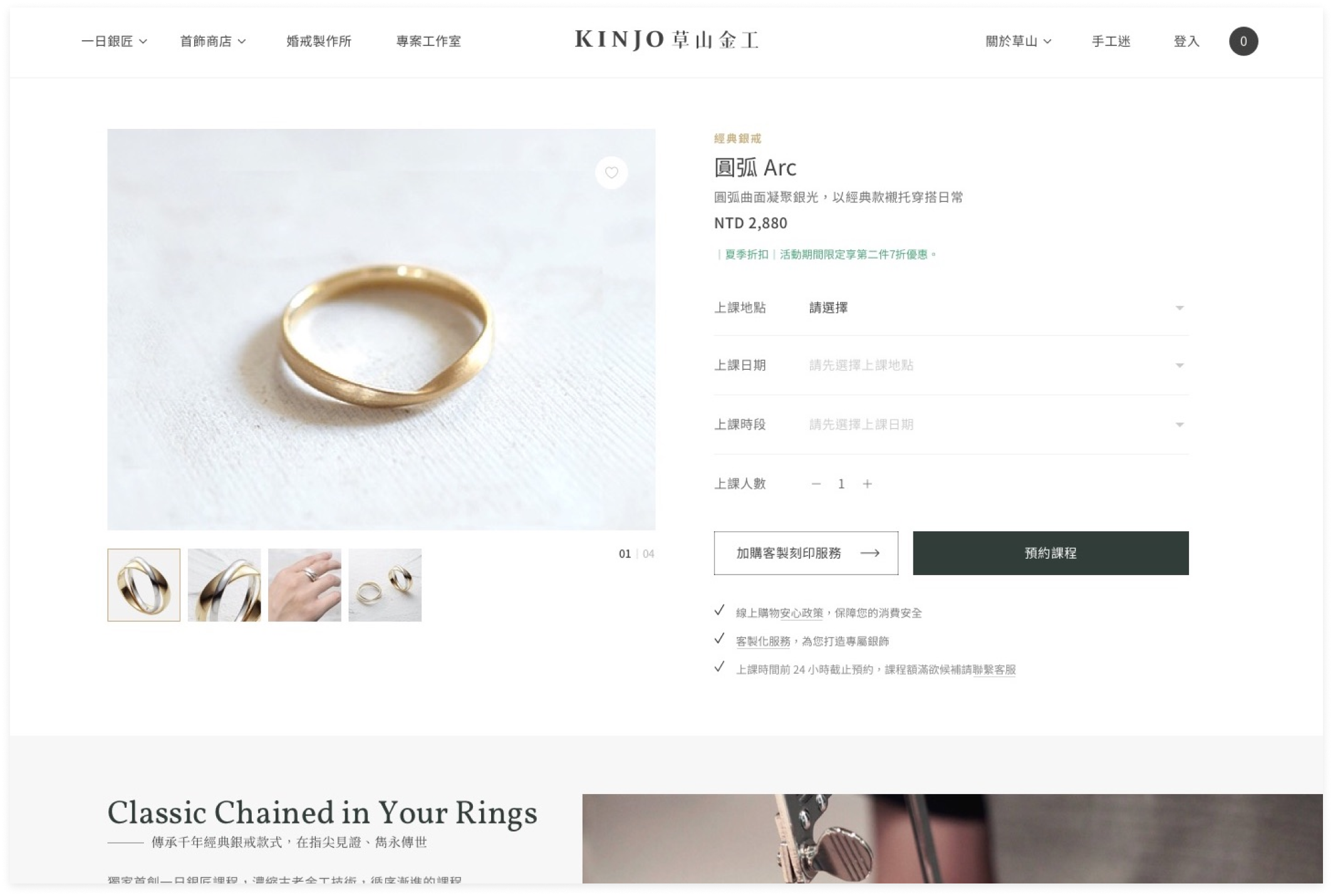
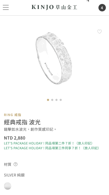
Customize the ring and add it to the cart
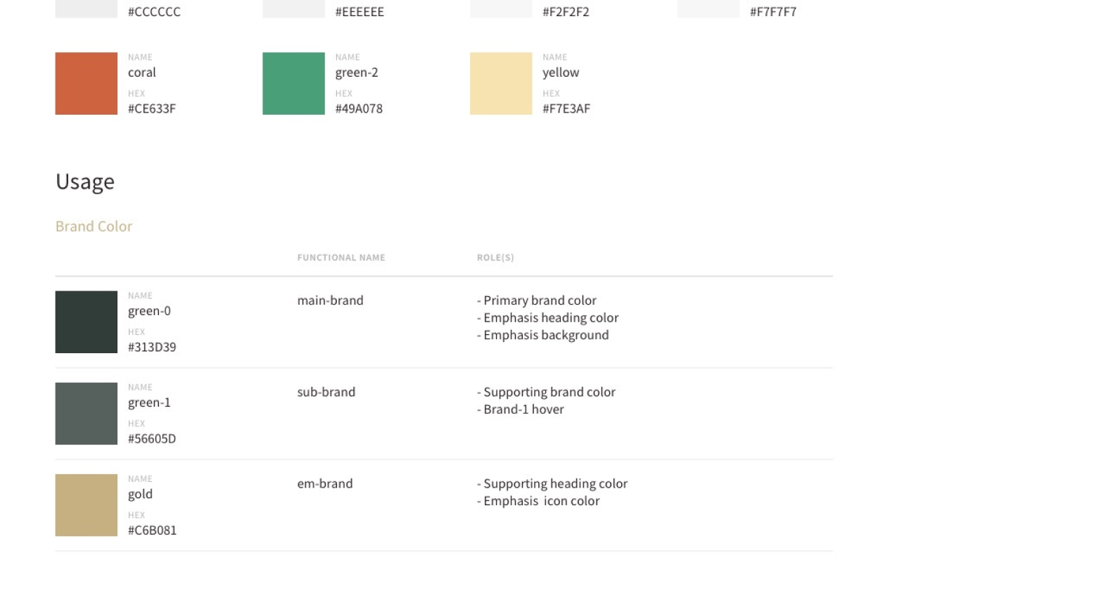
· · ·
DESIGN HIGHLIGHT
A Well-define Design Guideline to Highly Improve the Working Process
We created a complete guideline for KINJO. For every color, we define clearly the usages and even codename using for developers. For typography, every kind of heading, paragraph, and even spec for RWD are well defined. Our developers were satisfied by the system we built, makes them start a project more quickly than before. There is no need to ask designers, again and again. For designers, we can also define this fundamental guideline fast in the future. It is not only a guideline for the website, which could be easily applied to the marketing material using widely across the different funnel.
Color usage

Reflection

· · ·
As a web designer working at a digital agency, the budget is the critical condition of any project. I was lucky to be part of the KINJO project with such a large scope. During production, I spent much time discussing with front-end developers and find that there are still processes and designs we can improve.

For example, I did not think of interaction much before. Even I had some references in hand, I did not organize them well and only find them out while developers ask. So we tried FSM (Finite-state machine) for the first time and noted other details on Confluence. Developers also left their questions on it for more discussion. Still not familiar with the working process, but it was a good start at least.
THE PROCESS / 01
Research, Understand & Define
· · ·
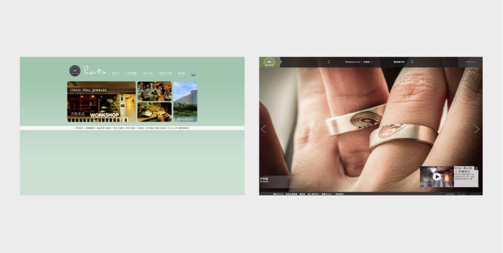
There are their official websites previously, 2008 on the left, 2011 on the right.
KICKOFF
Exploring the Opportunity
Firstly, we used Similar Web to analyze the original website and we found that about 67% of visits were from organic search, which means high brand awareness. However , customers can only get limited information from blogger and facebook business page, rather than the official website. Therefore, we discussed lots with the client about organizing the information hierarchy for the new website.
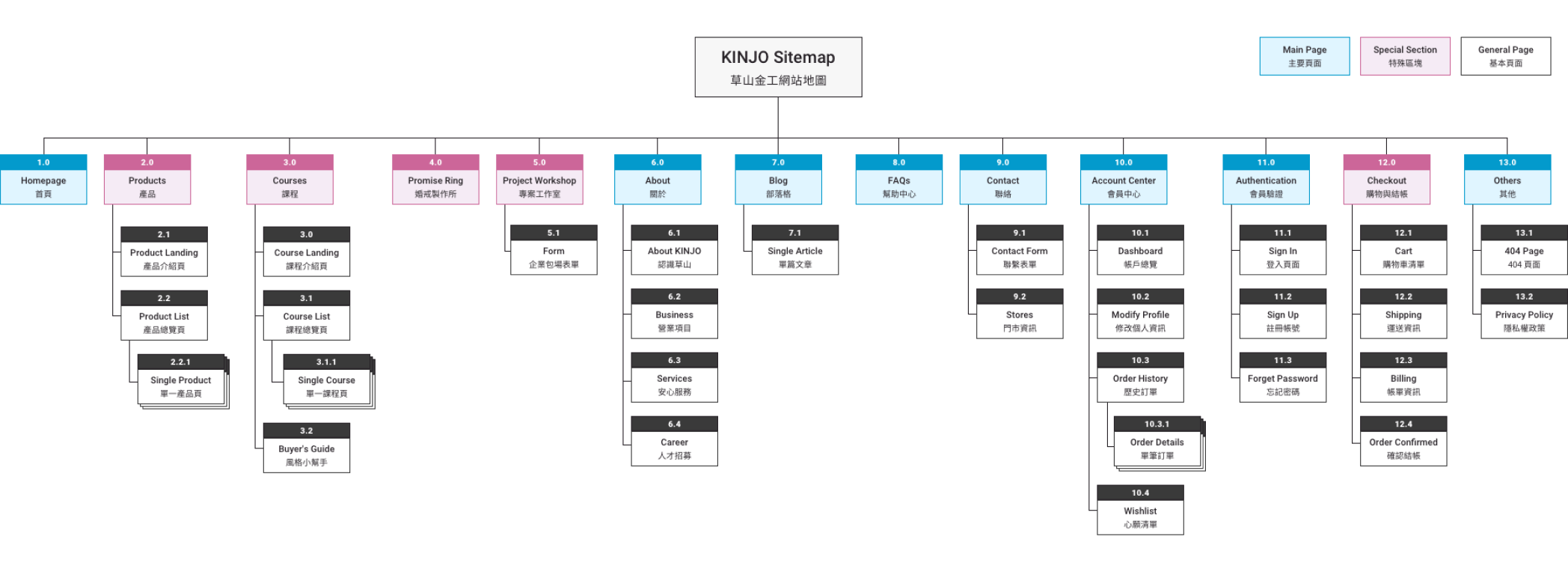
We spent lots of time discussing with the client about the new information architecture for the new website.
RESEARCH
Think Thoroughly like Picking the Wedding Ring
The ring is not a simple product. You have to consider the size, the personalized engraving, and the materials. Other than that, course booking is also complicated. The most challenging part is how to sync the remaining seats within date, time, and stores. To think comprehensively, we worked with developers during the research phase to prevent technical limitations as far as possible.

We provided some selected design references to the client. After discussion, we defined the design direction to focus on storytelling like the brand motto, A Memory to Remember. From online experience to products and workshops, we would like customers to feel the brand from the heart and keep it as a beautiful memory in mind.
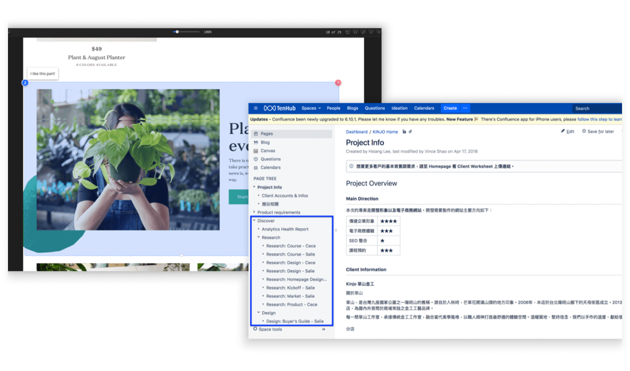
We used Eagle (Left) to collect ideas and inspiration and shared our research notes on Confluence (Right).
THE PROCESS / 02
Design & Iterate
· · ·
FLOWCHART
Customers always Look for More
By interviewed the client and some potential customers, we concluded the user stories to multiple scenarios:
I want to make two rings at once, so I reserve two courses for only one customer.

I want to send my friend to join a course as a gift. Can I pay for the workshop without confirming the date?]

I am going to travel to Taiwan for five days. Unfortunately, there are no remaining seats. Can I call customer service to be on the waiting list?

If I only reserve the course, I do not have to fill out the address during checkout.


However, the process and requirements are getting complicated. It was necessary to simplify it and narrow down the scope. After frequent discussion with the developers and confirmed with the client, we drew the flowchart to double-check all the situations can be satisfied.
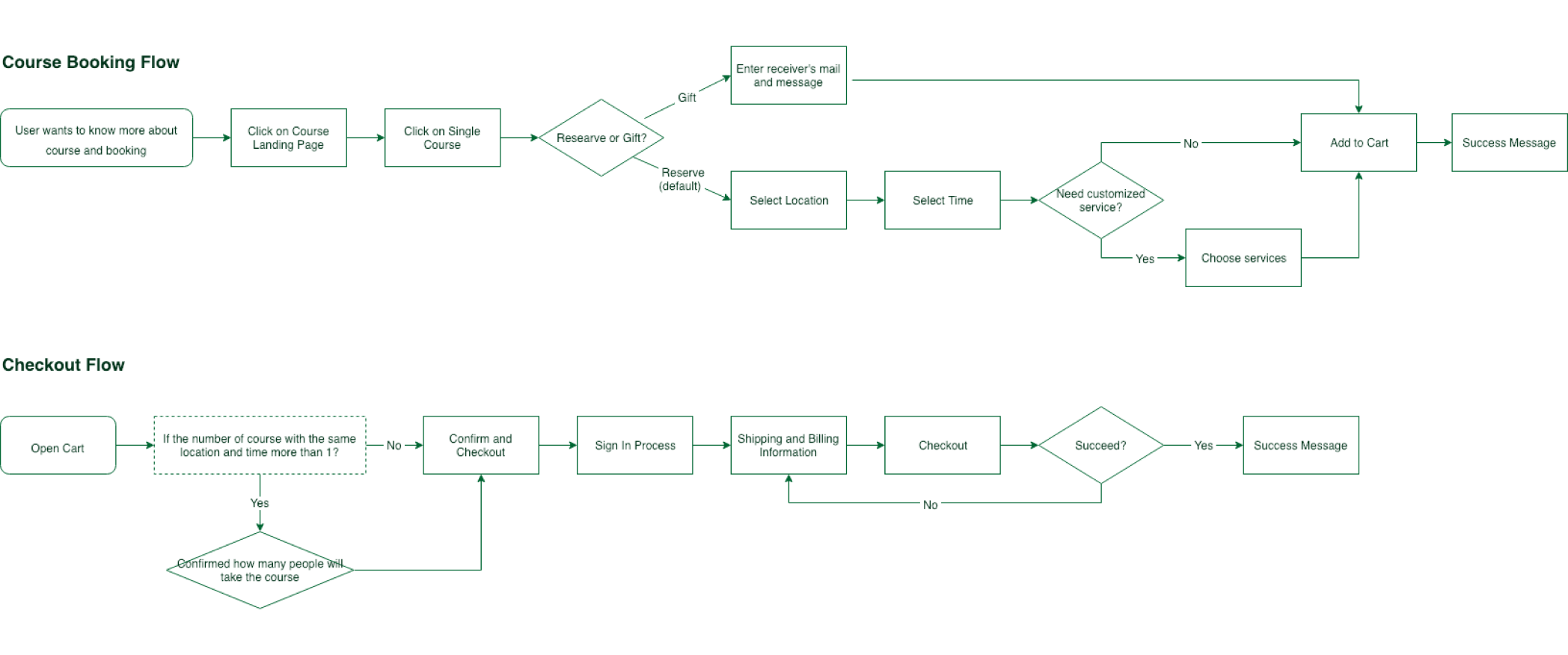
The flowchart was way more complicated initially. We simplified it due to technical constraints and project scope.
· · ·
WIREFRAME
Define How to Express the Deeper Story
After confirming the flow, it had been easier to connect all the dots on the website. However, other than the customization and booking, it is critical to describe the brand story to the customers. The process of metalworking is also appealing for those who want to join the workshop.

To clarify those massive content, I sketched and used Axure to create wireframes for the initial discussion. There are two primary services: Product and Workshop. Each of them has its landing page to explain details about categories and recommendations. No matter the customers have already heard of KINJO before or not, they will know them better. Most importantly, find the ring they always want for a long time and even make it by themself.
Course Landing Page
Single Course Page
· · ·
MOCKUP
Show the Elegance in Every Detail
Based on the sitemap above, more than twenty static pages need to design, not to mention the dynamic pages with the shopping and reservation flow. I worked with another designer , Cece, to complete the mockup together. At the beginning of the project kickoff, she focused on branding and visuals. After defined the style and direction, I started building the design system and library to accelerate the working process.

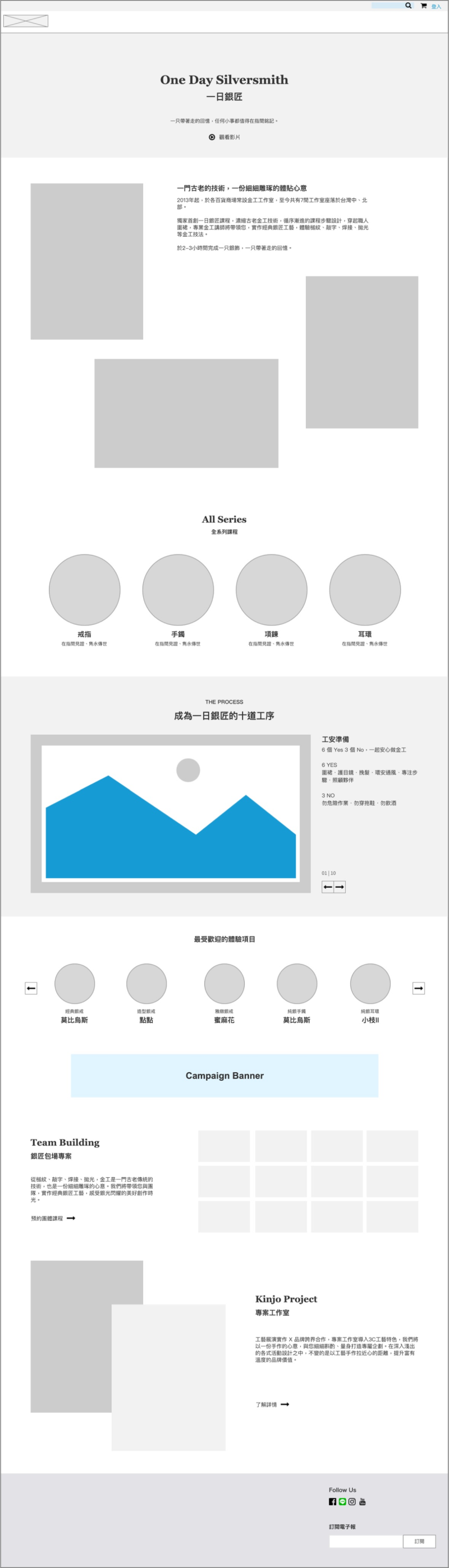
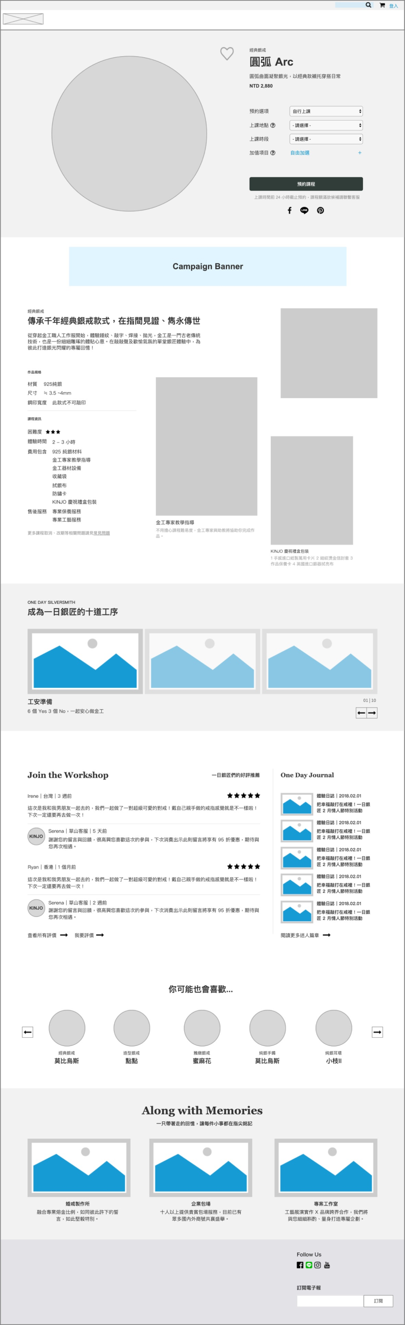
We created an abundance of various components to bring out the story about the brand, making process, product details , and metalworking knowledge. It is not only about selling products but telling a story that we sincerely want to share.
Course Reservation
· · ·
DESIGN SYSTEM
Just Learned the Importance of Design System
Usually, our clients do not put much budget on digital branding. Fortunately, this project is big enough to define a proper design system. It was not only a challenge for myself but all the team members. Hence we spent many resources and time discussing and learned together. I collaborated closely with front-end engineers to build a design system that satisfied both needs. As a web designer , I finally understood the importance of component naming and the technical language we should know to better communicate with the engineers.

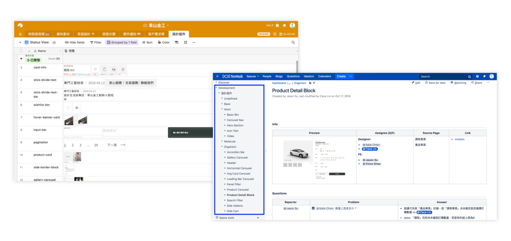
I researched other design systems for reference, such as Material Design (Google), Carbon Design System (IBM), Lightning Design System (Salesforce). Eventually, we organized the symbols on Airtable (Left) and took documentation on Confluence (Right).

THE PROCESS / 03
Next Step
· · ·
The project had a pre-launch at the end of October 2018. Promise Rings with customization flow and buyer's guide will implement in the later phase.